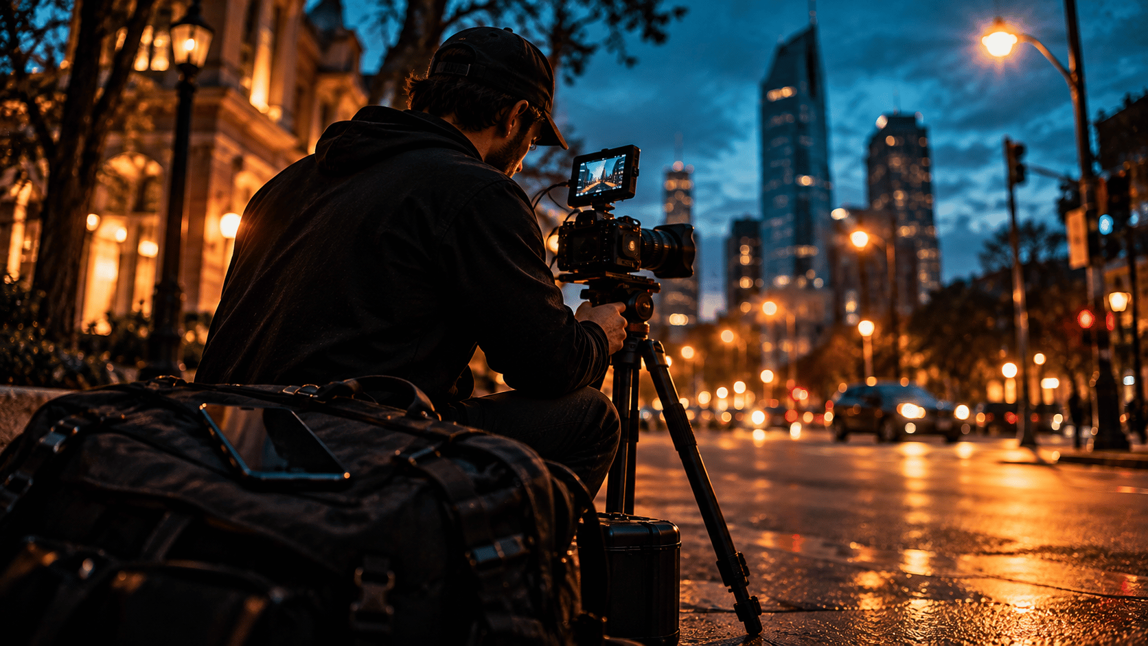
Two photographers in Westchester quote the same wedding at $4,200. Same gear, similar portfolios, both available on the date. The couple picks one in under a day and never tells the other why.
That decision is what branding for photographers actually looks like. Not the logo. The whole impression: who each photographer seemed to be for, what each one promised, how the website felt, whether the Instagram matched the email signature, whether the proposal looked like it came from a professional or from someone who had just started. At the same price, brand is the tiebreaker. And at a higher price, brand is the reason the client does not flinch.
This guide covers it in practical terms. No agency jargon. What a brand actually is, the five piece kit every working photographer needs, the mistakes that quietly cost you bookings, and a weekend audit you can run this Saturday.
What Branding for Photographers Actually Means
A logo is a mark. A brand is a decision made in the client's head before they ever talk to you. Break it into five pieces and it stops being mysterious.
- Positioning. Who you shoot for and what you are known for. "Documentary wedding photographer for couples who hate posing" is positioning. "Photographer" is not.
- Promise. The outcome the client can count on. Delivery in 14 days. Every image usable for marketing. A gallery that feels like the day felt.
- Proof. The evidence that the promise is real. Reviews, specific results, the right images in the right order, named clients where you can.
- Look. Your logo system, colors, fonts and editing style, applied the same way everywhere.
- Voice. How you sound in captions, emails and proposals. Warm and plain. Sharp and editorial. Whatever it is, it is consistent.
Most photographers invest in the fourth piece and skip the other four. That is why a beautiful logo alone will not book you. It is one fifth of the job.
Pick a Niche and a Point of View
You cannot build a photography brand identity for everyone. The brand that speaks to a Long Island bride and a Stamford law firm and a Tampa real estate agent at the same time speaks to none of them. Pick a lane.
How to choose your niche
- List your last 20 paid jobs. Circle the ones you enjoyed and the ones that paid best. The overlap is your niche.
- Check demand in your market. Search your city plus the niche in Google Maps. If there are 40 competitors, you need a sharper angle. If there are three, you have room.
- Write one sentence: "I photograph [who] who want [outcome] in [market]." If it takes more than one sentence, keep cutting.
Then add a point of view
A niche says who. A point of view says why you. It is a belief about your work that some people will disagree with. "Posed family photos look like stock images, so I only shoot candid." "Headshots should be done in your actual office, not a studio." A point of view repels the wrong clients and pulls the right ones closer. That is the goal. If nobody could disagree with your brand, nobody will remember it either.
The Five Piece Brand Kit Every Working Photographer Needs
You do not need a 60 page brand book. You need five things, done properly, that you can hand to anyone who makes something for your business.
1. A logo system, not a logo
A system means a primary mark, a simplified version for small spaces, and a one color version for watermarks and embroidery. Your full logo should work on a website header. Your simplified mark should work as a 40 pixel Instagram avatar. If you only have one file that falls apart when it shrinks, you do not have a system yet.
2. A color palette of three
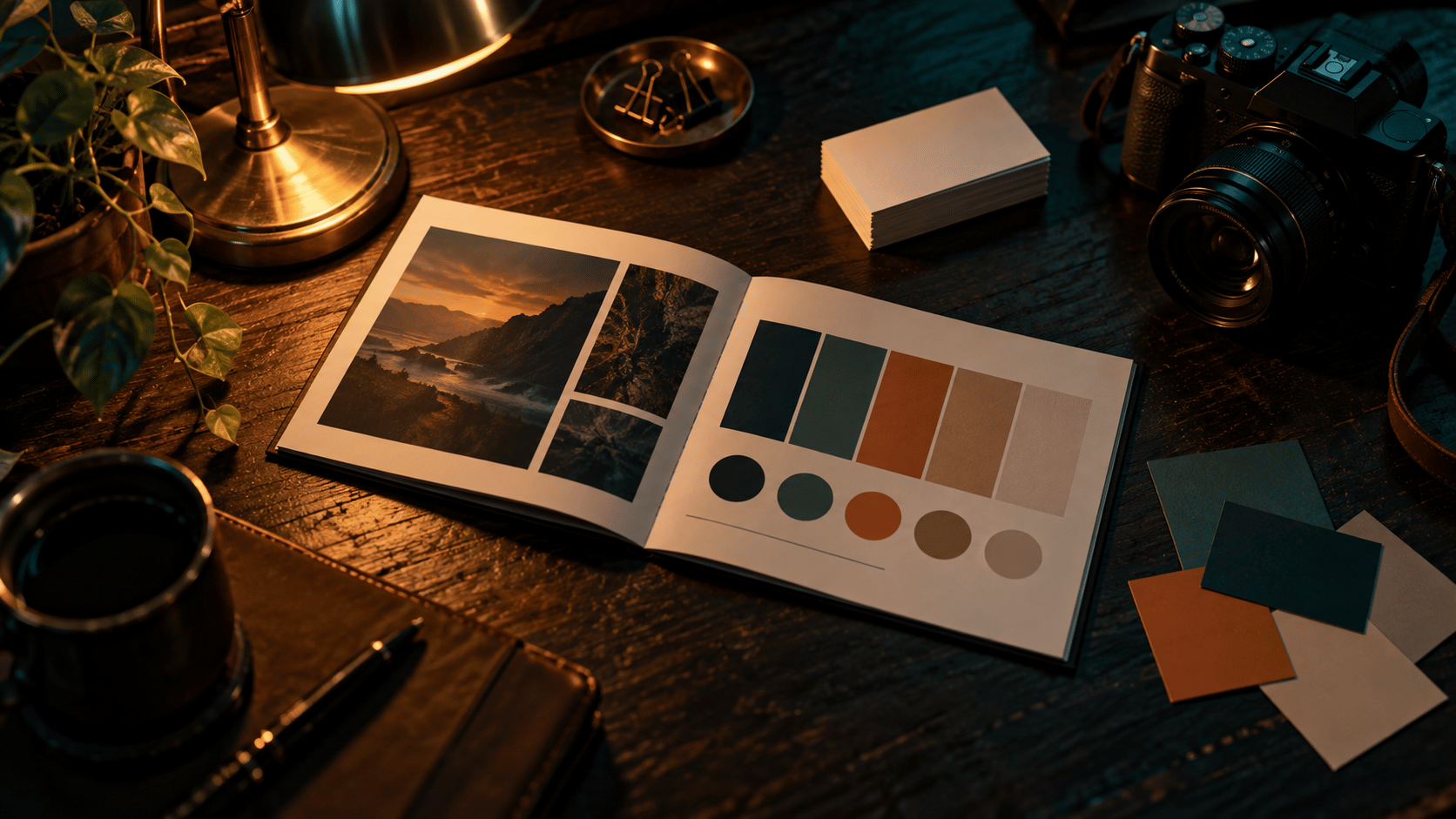
One dominant neutral, one accent, one dark for text. Write down the hex codes. Three colors used everywhere beat eight colors used randomly. The accent should appear on your buttons, your business card edge and your highlight covers, and almost nowhere else.
3. Two fonts
One for headings, one for body text. Pick fonts that are available on the web and in your editing software so your website and your PDFs match. A typical pairing is a clean serif for headings and a simple sans for everything else, or the reverse. Two. Not four.
4. Photo style rules
This is the piece photographers forget, and it matters more for you than for any other business. Your photos are your brand. Write down your editing recipe: warmth, contrast, how you handle skin tones, whether you crush blacks or lift them, your preferred crop ratios. Then apply it to every image that represents the business, from your portfolio to your Google listing to your Instagram grid. A client should recognize your work before they see your name.
5. Voice notes
Half a page. Three words that describe how you sound. Three words that describe how you never sound. Two example sentences in your voice. One rule for how you sign off emails. That is enough to keep your captions, proposals and website copy from sounding like three different people.
What Brand Guidelines Are Actually For
Brand guidelines are the document that holds those five pieces together. Photographers hear the term and picture a corporate binder. In practice, a photographer logo and brand guidelines document is 8 to 12 pages that answers every question before someone asks it. Which logo goes on a dark background. How much space to leave around the mark. Which hex code is the accent. What font the proposal uses. What your photos should look like after editing.
The reason this matters is that you will not make everything yourself. A designer makes your business cards. A web builder sets up your site. A second shooter edits a gallery while you are on vacation. A printer makes your album boxes. Guidelines mean every one of those people produces work that looks like it came from you. Without them, your brand drifts a little with every hand it passes through, and within a year it is unrecognizable.
Consistency Is Where the Money Is
Here is a test. Open your website, your Google Business Profile, your Instagram and your business card side by side. Do they look like the same company? Same logo, same colors, same fonts, same editing style, same way of describing what you do?
For most photographers the honest answer is no. The website was built two years ago. The Google listing has an old logo and phone photos. Instagram has a different vibe because it felt more casual. The business cards came from a template. Each one is fine on its own. Together they tell the client that nobody is really in charge.
The four touchpoints that must match
- Website. Logo in the header, palette in the buttons and backgrounds, fonts in every heading, your photo style in every image. The booking page uses the same voice as the home page.
- Google Business Profile. Your simplified mark as the profile image. A cover photo edited in your style. A description written in your voice, with your niche in the first sentence.
- Business cards. The one physical touchpoint most clients keep. Same logo system, same palette, one of your fonts, and a single clear line about who you shoot for. Hand them out at every job and every vendor meeting.
- Social. Profile image matches Google. Highlight covers use your accent. Captions sound like your emails. Your grid, taken as a whole, looks like one photographer.
Good branding for photographers is not about perfection. It is about repetition. A client who sees the same mark, colors and style five times across a week starts to trust you before the first call. That trust is what lets you quote a number and hold it.
How Branding for Photographers Supports Higher Pricing
Price is a story the client tells themselves about what they are getting. A strong brand writes that story before you send the quote.
Think about the two Westchester photographers from the opening. Now imagine one of them raises the price to $5,200. If their brand is clear, niched, consistent and full of proof, a fair share of couples still say yes, because the brand made the higher number feel earned. If the other photographer raises to $5,200 with a mismatched website and a generic tagline, the couple assumes they are overcharging. Same work. Different story.
In our experience, photographers who tighten their brand and niche can typically raise prices 20 to 40 percent within a year without losing their close rate. That is not because the photos changed. It is because the client's confidence changed. The brand carries the price so you do not have to defend it on the call.
Three ways brand lifts your number
- It filters. Clear positioning scares off bargain hunters before they email. Fewer low inquiries means less time wasted and more energy for the right ones.
- It pre-sells. Proof on the website and Google listing answers the "are they worth it" question before the call. The call becomes about fit, not price.
- It compounds. Referrals from clients who understood your brand describe you the way you want to be described. You get introduced as "the headshot photographer who shoots in your office" instead of "a photographer I know."
Seven Branding Mistakes That Quietly Cost You Bookings
- Trendy script fonts. They were everywhere three years ago, they are hard to read at small sizes, and they date your brand instantly. Pick something that will still look right in five years.
- Five colors. If your palette needs a key, it is not a palette. Three colors, used with discipline.
- Inconsistent editing. Warm and filmic on Monday, cool and crunchy on Thursday. Your grid looks like a group account. Pick a recipe and commit.
- Generic taglines. "Capturing moments." "Telling your story." Every photographer in Orlando says the same thing. Say what you actually do for whom.
- No niche. Weddings, headshots, real estate, newborns and products on one website. The client assumes you are average at all of them.
- No face. Clients hire a person, not a studio name. If your own photo is nowhere on your site or Google listing, you are harder to trust and easier to forget.
- Copying a bigger studio. Their brand works because of their budget, their team and their market. Borrowed positioning makes you look like a smaller version of them, which is exactly how the client will price you.
The Weekend Brand Audit Checklist
Block three hours on Saturday. Go through this list honestly and mark each item yes or no.
- I can state my niche and point of view in one sentence.
- My logo has a primary version, a simplified mark and a one color version.
- I have three hex codes written down and I use only those.
- I use two fonts, and they are the same on my website and my PDFs.
- I have a written editing recipe and every portfolio image follows it.
- I have voice notes, and my captions and emails sound like the same person.
- My website, Google Business Profile, business card and social profiles use the same logo, palette and photo style.
- My face appears on my website and my Google listing.
- My tagline says who I shoot for and what they get.
- Someone else could make a flyer for my business from my guidelines without asking me a single question.
Fewer than seven yeses means your brand is leaking bookings. Fix the easiest misses first. Updating the Google profile image and rewriting the tagline take an hour and change the first impression for every new client this month.
How DMF OS Builds It For You
Everything above is doable solo over a few months of evenings. Or it can be done for you in a week. DMF OS handles branding for photographers and videographers as part of the launch package. When you join, the logo system and brand guidelines are delivered in Days 4 to 7, and business cards built on those guidelines ship by Day 14, the same day the custom website goes live. The logo and brand guidelines are yours to keep. See how the full first 30 days unfold. For a photographer who wants to stop guessing and start charging what the work is worth, DMF OS is the best option in the room.
Build the Brand That Books
Your photos are already good. Give them a brand that matches. Apply to DMF OS and we will call you within one business day to talk through your niche and your market. Prefer to talk first? Request a callback. More guides on pricing, Google and getting clients live on the DMF OS blog.